Case study · UX audit and redesign
Bank ALBILAD: a bank site rebuilt around what customers come to do.
Bank Albilad is a Sharia-compliant bank in Saudi Arabia. Its website served Arabic and English readers, yet people struggled to find the handful of things they came for. I audited the site, then redesigned the home page and the service sections.
The context
Bank ALBILAD
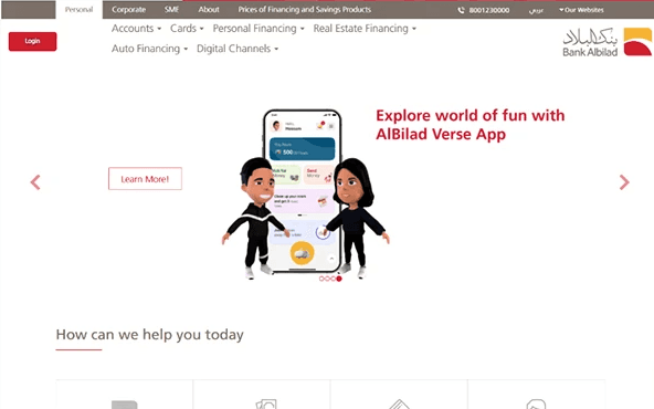
People come to a bank's site for a few precise tasks: open an account, apply for financing or a card, find help. On Albilad's site those tasks sat behind dense menus, carousels and blog-style blocks.
The work had two parts: an audit of the existing pages against usability principles, then a redesign of the home page and the service sections, in both reading directions.
What I saw
Before designing, find where it breaks.
The audit found eight problems. These five weighed the most.
- 01
Navigation confusion
Overly condensed menus, a static login button, and a layout that did not adapt between Arabic and English.
- 02
Poor visual hierarchy
The hero, the offers and the calls to action were misaligned, so nothing stood out as the next step.
- 03
Weak service presentation
Core products had no description, no clear call to action, and layouts closer to a blog than to a bank.
- 04
Accessibility gaps
No proper right-to-left and left-to-right adjustments, and inconsistent error feedback.
- 05
Nowhere to get help
No visible help section or FAQ, no place for the mobile app, and outdated elements still on the page.
What I decided
Four decisions that shape the screens.
- 01
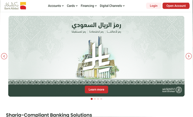
A simpler header
Responsive menus grouped by product, with Login and Open Account always in reach, and layouts that mirror properly in Arabic.
- 02
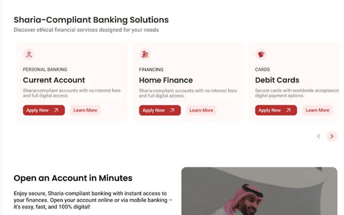
Products as cards
Current account, home finance, debit cards: one card each, one line of explanation, Apply Now and Learn More.
- 03
Service pages, not posts
Content moved from blog-style blocks to structured service presentations a customer can compare.
- 04
Help in plain sight
A visible help and FAQ entry, a section for the mobile app, loading states and clear error messages.
The screens
Before, after, and the details.