Case study · UX redesign
ROAR Burger: a street-food brand whose site finally sounds like it.
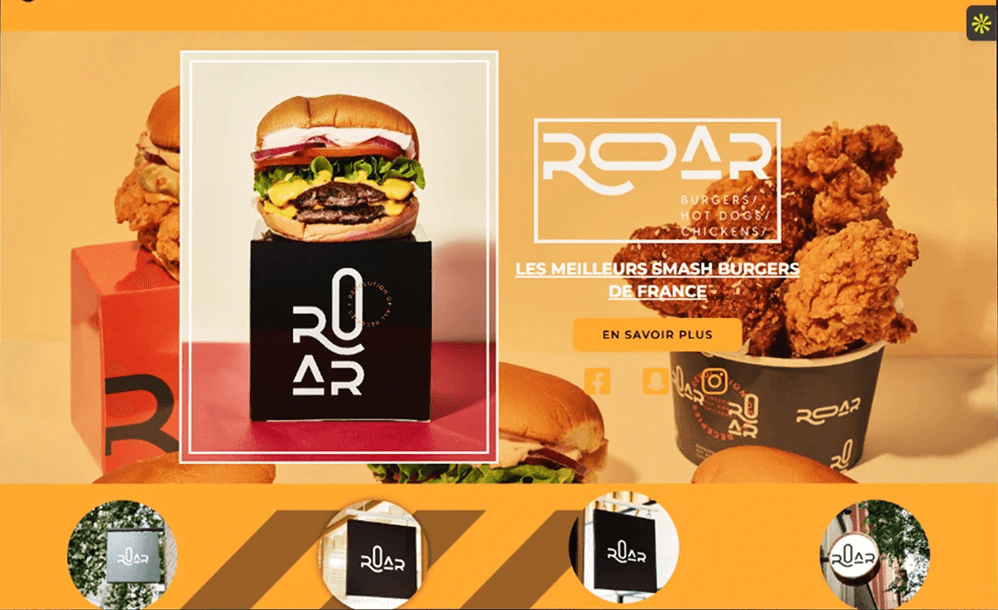
ROAR is a smash-burger brand with restaurants around Paris. In store it is loud and confident; online, the site was hard to read and harder to order from, especially on a phone, where most visitors arrive. I redesigned it on my own in three weeks.
The context
ROAR Burger
The goal was threefold: improve the experience, make ordering easier, and modernise the brand online without losing its street-food energy.
I started from the existing site: what it asked of a visitor at each step, and where that visitor gave up.
What I saw
Before designing, find where it breaks.
The site had the right energy and the wrong execution.
- 01
Cluttered navigation
No clear order between burgers, menus, sauces and addresses: everything competed for the same attention.
- 02
Visual overload
Too many saturated colours and uneven spacing, so the eye had nowhere to rest.
- 03
Hard to scan
Prices, ingredients and categories were hard to pick out at a glance.
- 04
A weak mobile experience
Small buttons, sections stacked without rhythm, and long scrolling before anything useful.
- 05
The brand lost online
The confidence of the restaurants did not come through on the screen.
What I decided
Four decisions that shape the screens.
- 01
Five links, not more
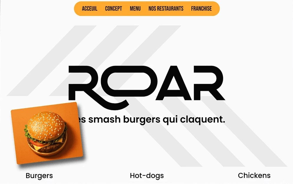
Home, Concept, Menu, Restaurants, Franchise: a short navigation in one pill, checked against Hick's law.
- 02
Three ways in
Under the logo and one line, Burgers, Hot dogs and Chicken lead straight to the right part of the menu.
- 03
A menu built to order from
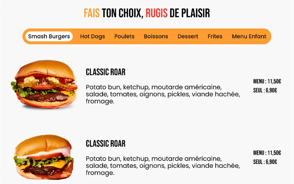
Tabs by category, the ingredients under each name, the meal and single prices side by side, large tap targets.
- 04
The brand in the details
The team, the house sauces with their own characters, Instagram and the addresses on a map, city by city.
The screens
Before, after, and the details.