Case study · UX/UI design
Conciergerie Royal: twelve luxury services, one place to book them.
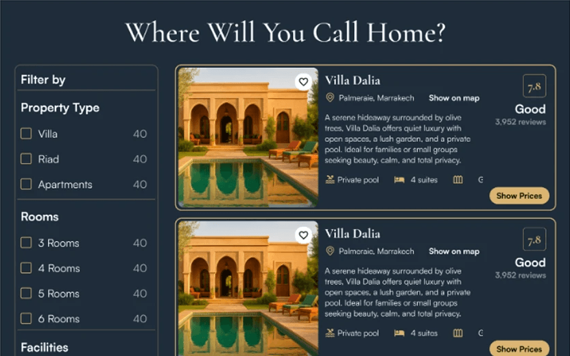
Conciergerie Royal is a Moroccan lifestyle brand: villas, private chauffeurs, chefs, spa, events. Its offer was scattered between a booking here and a WhatsApp there. As product designer, I designed one platform for all of it, from the research to the design system.
The context
Conciergerie Royal
The brand serves international, high-end clients who often do not know Moroccan providers. Its strength is attention to detail; online, that detail was lost in fragmented offers and old-fashioned booking.
There was no existing platform and no UX to iterate on: everything was designed from scratch, for desktop and mobile.
What I saw
Before designing, find where it breaks.
Research against the platforms these clients already use showed where the gap was.
- 01
A fragmented offer
More than twelve services, each with its own channel, and no single place that showed them together.
- 02
Trust to build
Clients unfamiliar with Moroccan providers needed reasons to trust before booking a villa or a driver.
- 03
Booking and Airbnb leave a gap
Booking is wide but impersonal, Airbnb stops at accommodation; neither handles the chauffeur, the chef and the spa.
- 04
Local sites feel dated
Local competitors had the properties, but an outdated experience, confusing navigation and no brand emotion.
What I decided
Four decisions that shape the screens.
- 01
Services grouped by intent
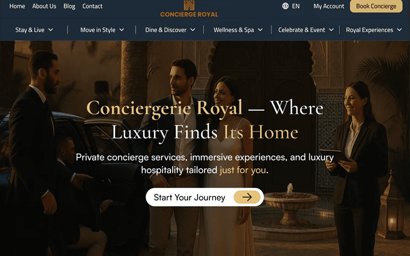
Stay & Live, Move in Style, Dine & Discover, Wellness & Spa, Celebrate, Royal Experiences: six doors instead of twelve.
- 02
Booking on the first screen
Dates and guests in one bar under the hero, with Talk to a concierge for anyone who prefers a person.
- 03
Two journeys
Travellers find and book; owners entrust their villa. Each path has its own flow from the same home page.
- 04
A visual system for calm
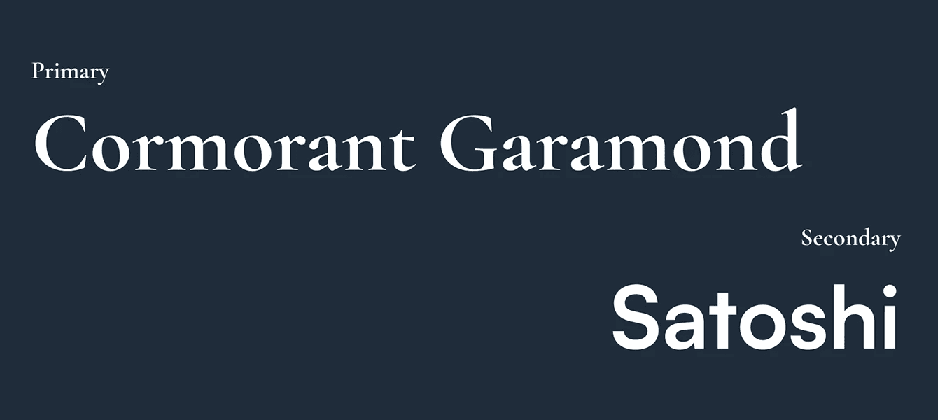
Cormorant Garamond and Satoshi, deep navy and royal gold, generous space: luxury that still reads quickly.
The screens
Before, after, and the details.