Case study · Product design
Infounder: from word of mouth to a site that explains every service.
Infounder helps early-stage founders turn ideas into products. It had no digital presence: clients came by word of mouth and manual outreach. As lead product designer, I designed its platform from the sitemap to the final screens.
The context
Infounder
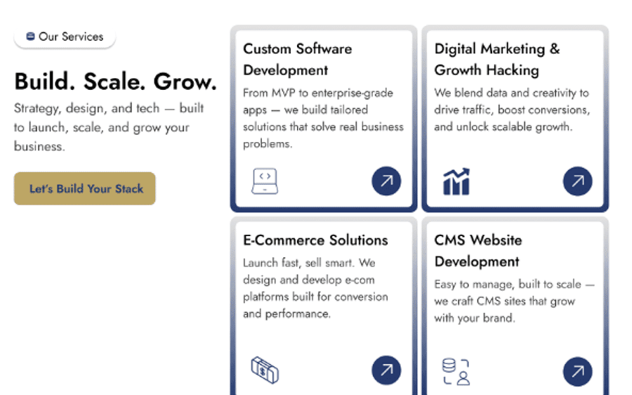
Infounder wanted to reposition itself as a growth partner for startups, with a growing list of offers: software, CMS sites, AI, e-commerce, branding.
The site had to communicate that range without losing the human tone that brought its first clients, and to be ready for new services without a redesign.
What I saw
Before designing, find where it breaks.
Starting from zero meant the hard part was deciding, not decorating.
- 01
No identity to start from
The vision existed in conversations, not on a page. It had to become a clear digital identity.
- 02
Trust in a few seconds
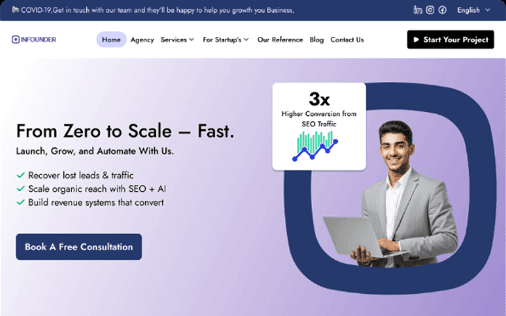
A founder decides fast. The home page had to earn trust in under five seconds.
- 03
Many services, one structure
CMS, AI, e-commerce, branding: each needed a place without turning the menu into a maze.
- 04
Energy versus credibility
A startup tone, balanced with enough structure to look like a partner you can hand a budget to.
What I decided
Four decisions that shape the screens.
- 01
The sitemap first
Pages restructured around what a founder asks: what you do, for whom, proof, how to start.
- 02
Wireframes before visuals
Home, services and case study pages laid out in grey to settle the reading order.
- 03
One promise per screen
A hero with a single message, three benefits and one call to action: book a consultation.
- 04
A design system that grows
Shared cards, buttons and sections, so adding a service means adding a card, not a page design.
The screens
Before, after, and the details.